


The COVID-19 pandemic has raised a number of public health concerns. How many people are infected, and where do they reside? How do those numbers stack up against the total number of people tested for the virus? Are there observable trends in the infection rate?
Even when governments make that data openly available, the data may not be in a format that is easy to understand. For example, poring over statistics in spreadsheets can be a laborious, time-consuming process. The Catalonia region of Spain realized that residents want a quick, easy way to find the answers they seek, so Hexagon built a dynamic dashboard for the region that provides a visualization of COVID-19 testing data almost instantly.
Keeping citizens informed
Based on M.App Enterprise, the dashboard breaks down COVID-19 test data by result (positive or negative), sex, location, and date. It also charts the data so that trends are easy to spot, and it performs geospatial analysis to give the number of
positive tests per 100,000 habitants in each region.
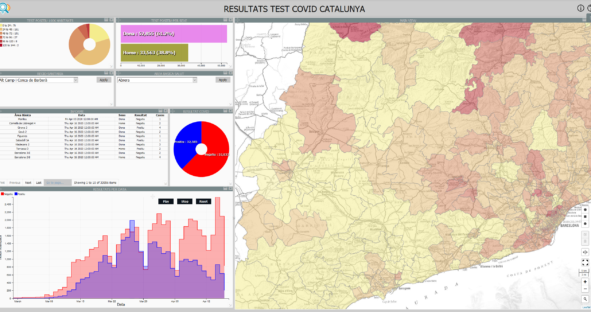
The dashboard is featured on Catalonia’s COVID-19 data page, making it easy for citizens to find and use. In times of fear and uncertainty, information is power. By making data accessible and easy to understand, Catalonia is empowering people to be proactive and make informed decisions about their health.
Hexagon is proud to be part of this initiative. Check out our dedicated COVID-19 page to learn more about how we’re responding to the pandemic and ways that our technologies are being leveraged for good.